Jinnie Hyojin Bae
← Work
DOHE
Unifying a Fragmented Digital Experience
I shaped the central DOHE website’s information architecture and UI with product and engineering, clarifying routes into three specialist experiences.
ROLE Design Manager INDUSTRY EdTech PERIOD 2024–Present
01 / CONTEXT & CHALLENGE
PROJECT CONTEXT
One organisation, three distinct pillars
DOHE operates across three core pillars, each with its own digital presence. The central DOHE website provides a clear entry point to three dedicated pillar websites.
DOHE
Central website
Go-Together
Dedicated website
Navigator
Dedicated website
EdTech Hub
Dedicated website
THE CHALLENGE
Creating a clearer digital entry point for DOHE
The challenge was to communicate DOHE's overarching identity and the relationship between its three pillars through one central website, while recognising the different content requirements of each specialist experience.
02 / UX AUDIT & INSIGHTS
Identifying barriers to content discovery and action
The existing website experience was reviewed to identify issues with information hierarchy, content discoverability and pathways to relevant actions. The qualitative audit highlighted three areas that informed the redesign.
UX Audit — Findings to Design Opportunities
01 / Fragmented Information Architecture
UX FINDING
Fragmented information architecture
USER IMPLICATION
Unclear content relationships
DESIGN OPPORTUNITY
Clearer navigation and central entry point
02 / Research-Led Content Structure
UX FINDING
Research-led, archive-style content
USER IMPLICATION
Difficult to identify key information
DESIGN OPPORTUNITY
Prioritised content hierarchy
03 / Limited Pathways from Information to Action
UX FINDING
Limited pathways to action
USER IMPLICATION
Unclear next steps
DESIGN OPPORTUNITY
More purposeful CTA pathways
Qualitative findings based on existing website screens and first-hand project context; no measured user behaviour is claimed.
03 / RESEARCH
RESEARCH / EXISTING EXPERIENCE AUDIT
Previous Portfolio and Cohorts pages show archive-style listings, extensive filters and repeated content cards—the visual evidence behind the findings in Section 02.
EXISTING WEBSITE EVIDENCE
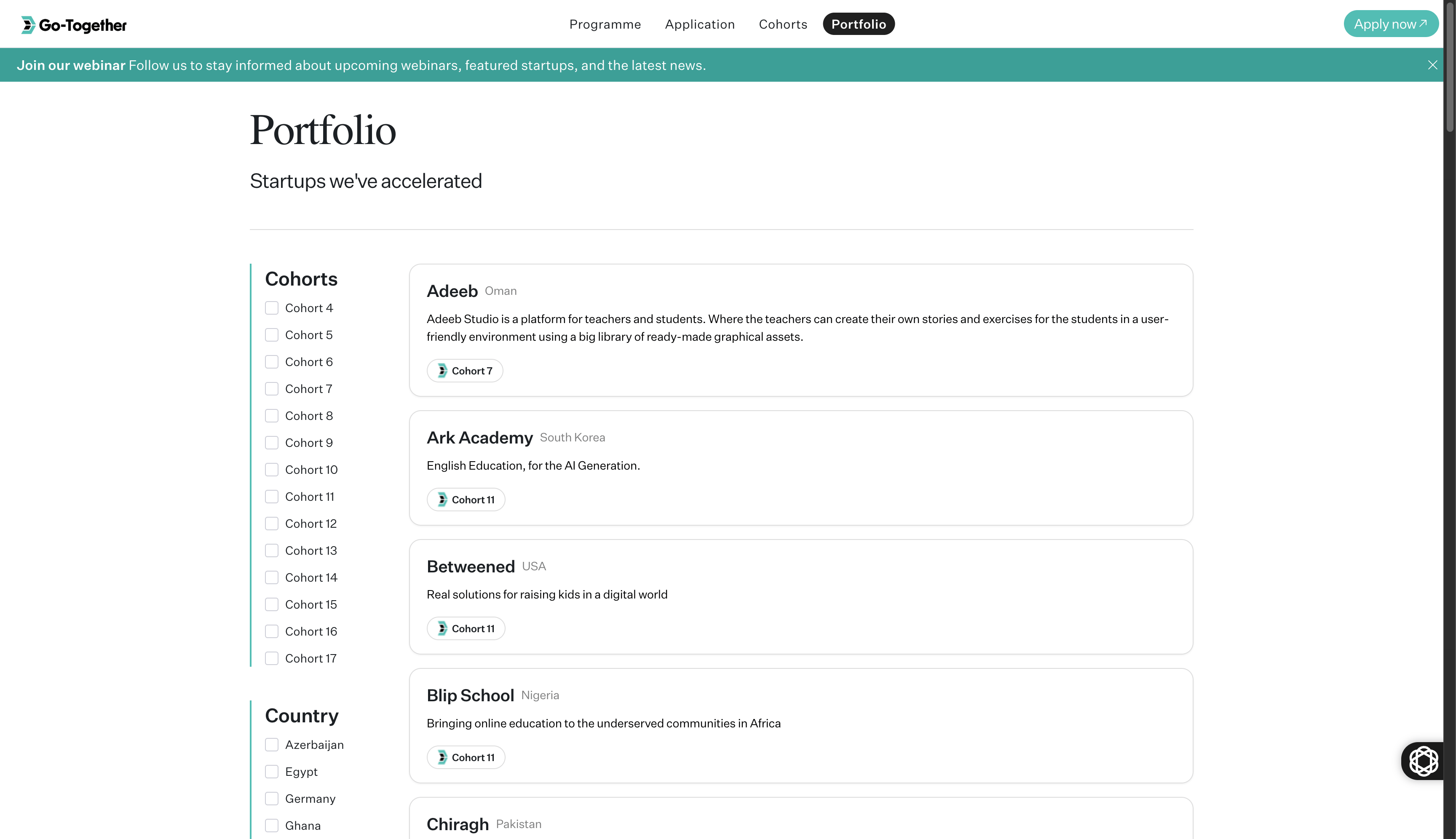
Archive-style listings and cohort/country filters.
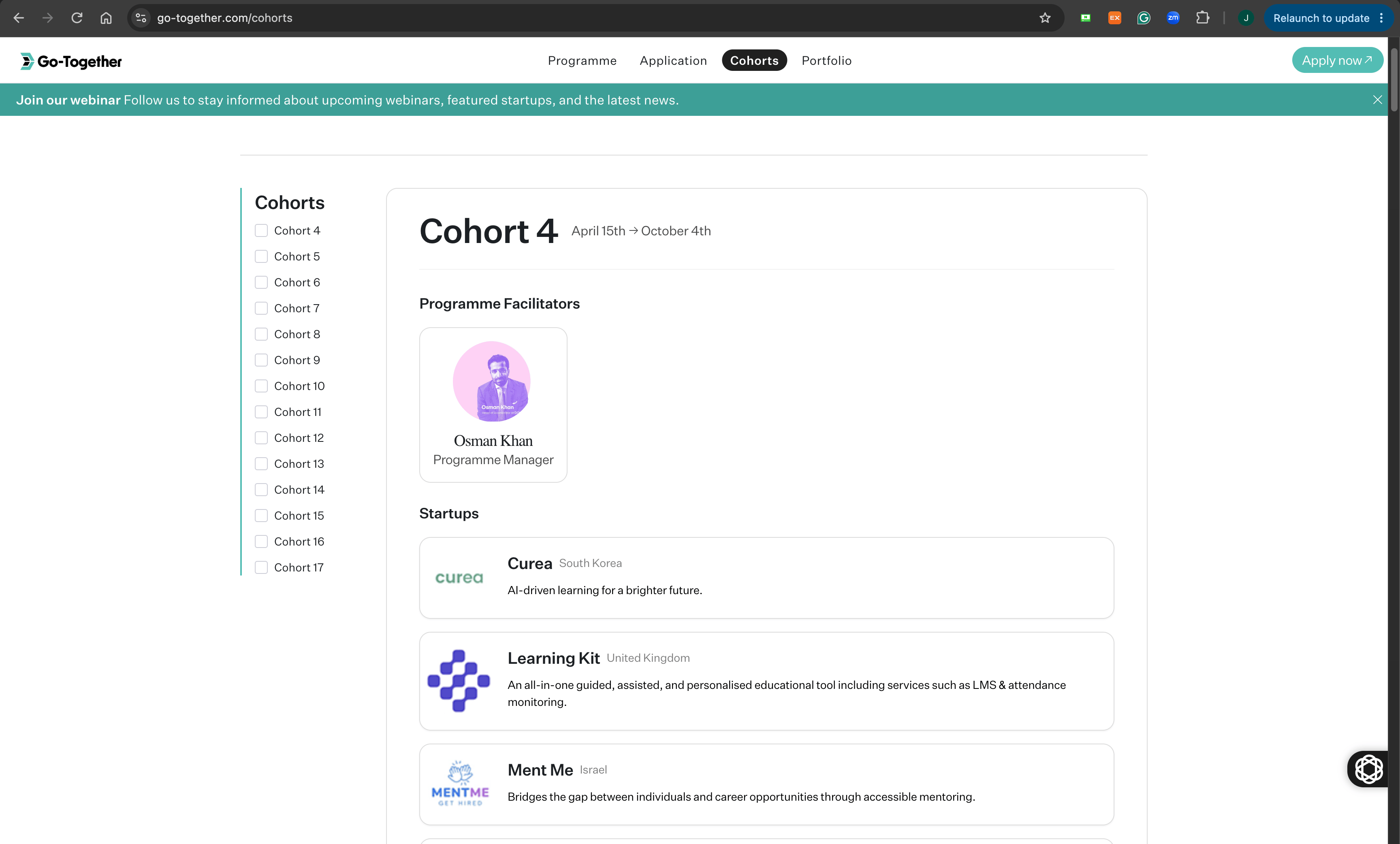
Cohort information and repeated startup entries.
04 / DESIGN
From fragmented information to a clearer entry point
Design rationale / Information architecture
THE PROBLEM
Fragmented information across separate websites
Archive-style content made the overarching DOHE structure difficult to understand.
THE DESIGN DECISION
One organisation overview, clear specialist routes
Prioritise an organisation-level introduction and its three core pillars, with routes to the specialist experiences.
LOW-FIDELITY WIREFRAMES
Structuring the website experience
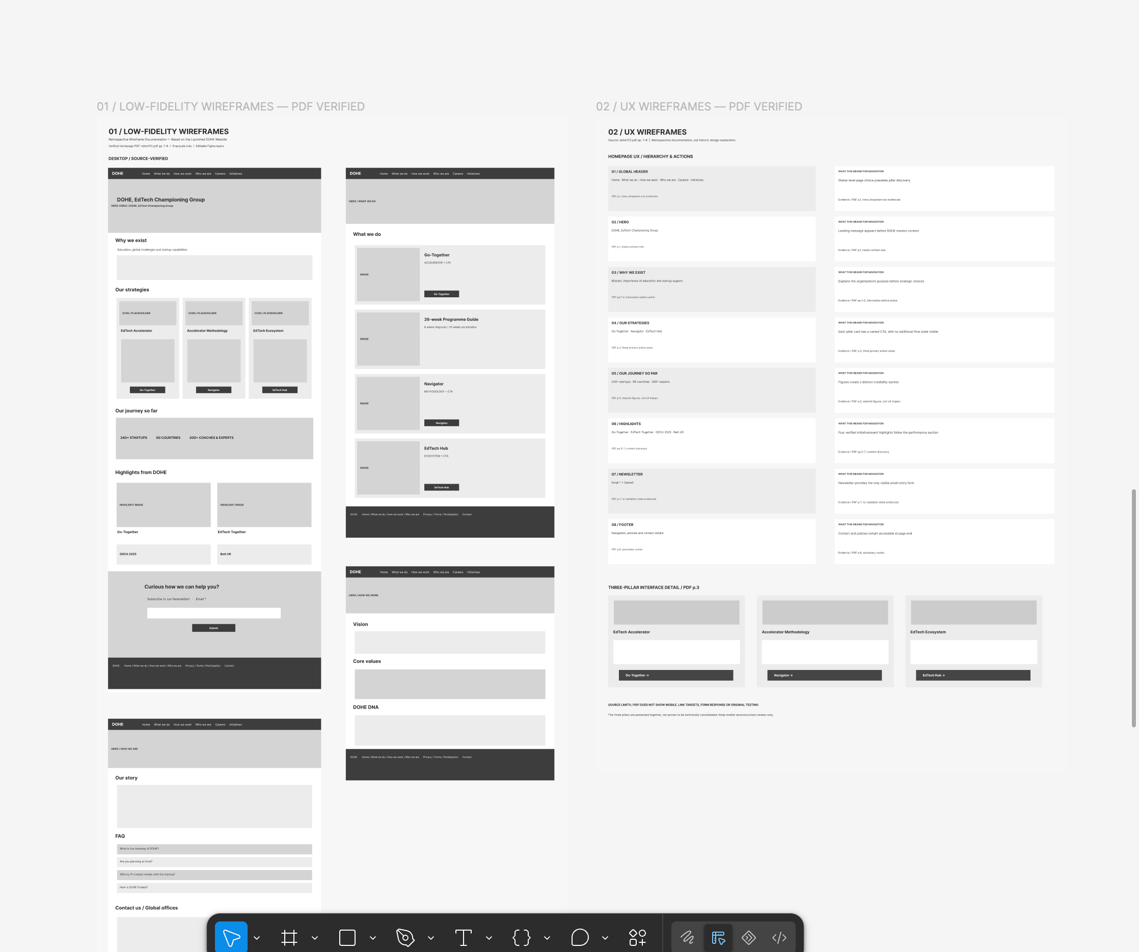
The wireframes document how key content, navigation and the three core pillars are organised within the main DOHE website.
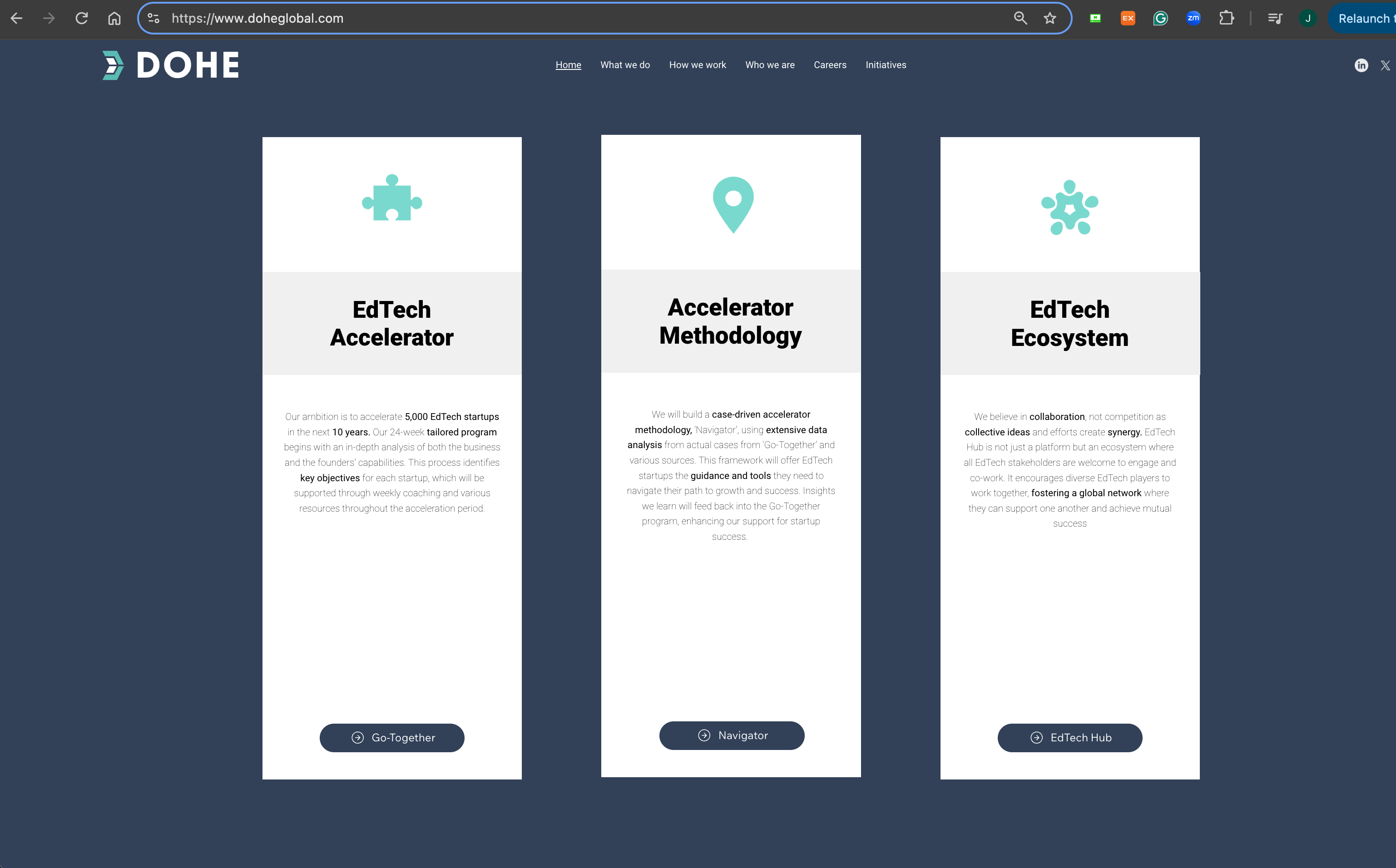
HIGH-FIDELITY / ADDITIONAL WEBSITE PAGES
Translating structure into a clearer digital experience
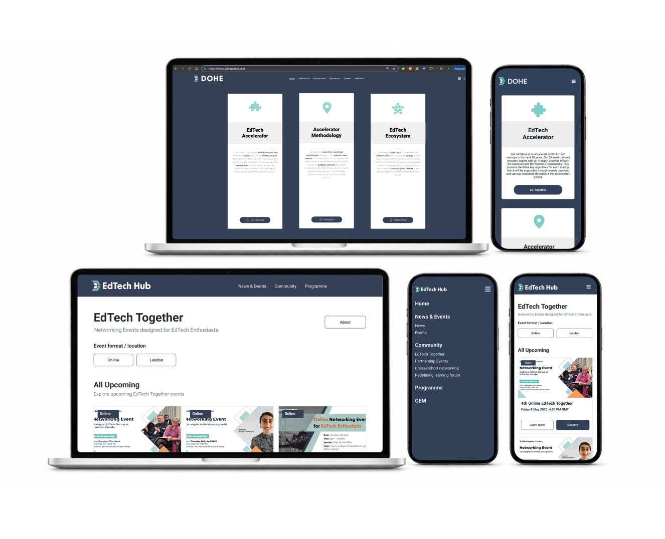
The high-fidelity pages show how the content structure was translated into interface layouts, with clearer hierarchy and navigation across related DOHE digital experiences.
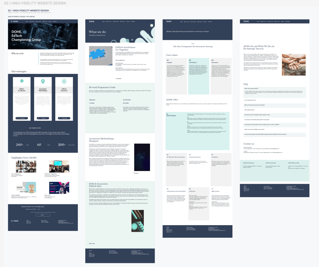
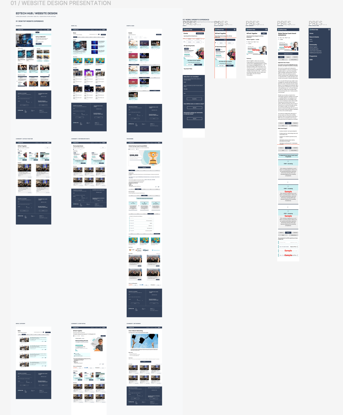
Additional page designs showing the wider website structure and content patterns.
05 / DELIVERY & ITERATION
INTERFACE GUIDANCE
Making event content clear for implementation
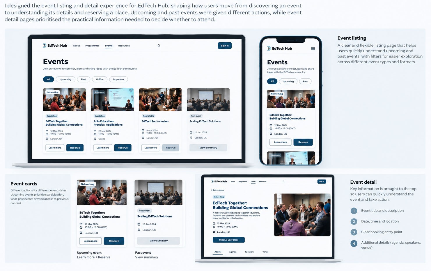
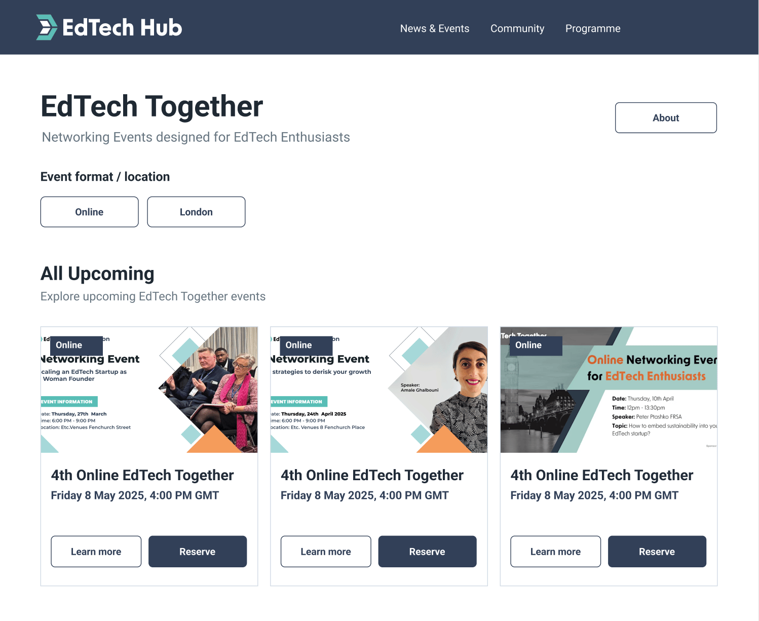
For EdTech Hub event pages, I documented full-title display, image sizes, heading and body typography, and rich-text formatting. This translated the intended content hierarchy into page-level implementation guidance.
Reusable interface patterns, navigation and layout conventions supported consistency across DOHE’s digital touchpoints.
PRODUCT & ENGINEERING COLLABORATION
Turning requirements into interface design
I worked with product managers and engineers to translate content and functional requirements into interface designs, reviewing layouts and refining details as requirements evolved.
Design decisions → Implementation guidance → Product and engineering review
06 / RESULTS
VERIFIED PROJECT OUTPUTS
Establishing a clearer foundation for DOHE’s digital ecosystem
The main DOHE website was redesigned to introduce the organisation and its three pillars through a clearer content and navigation structure. The work established a central place for essential information and pathways to specialist websites.
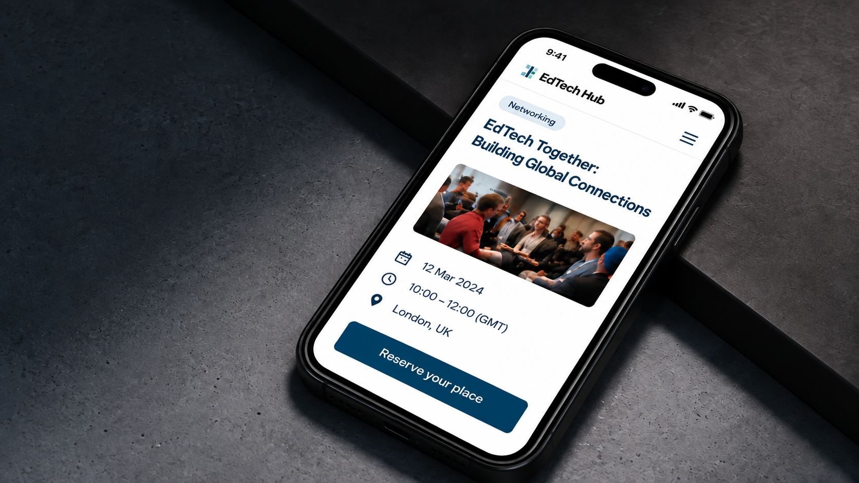
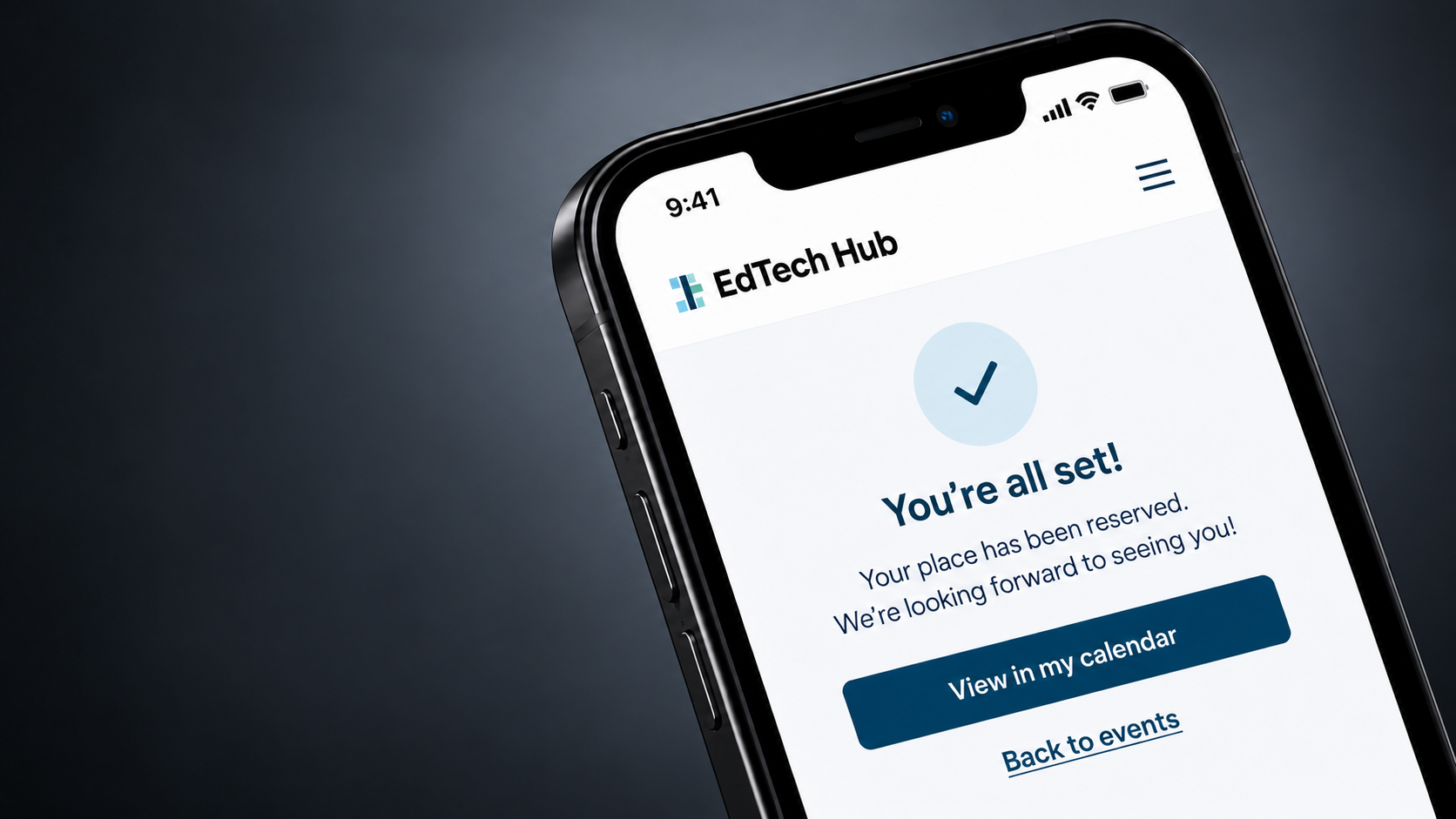
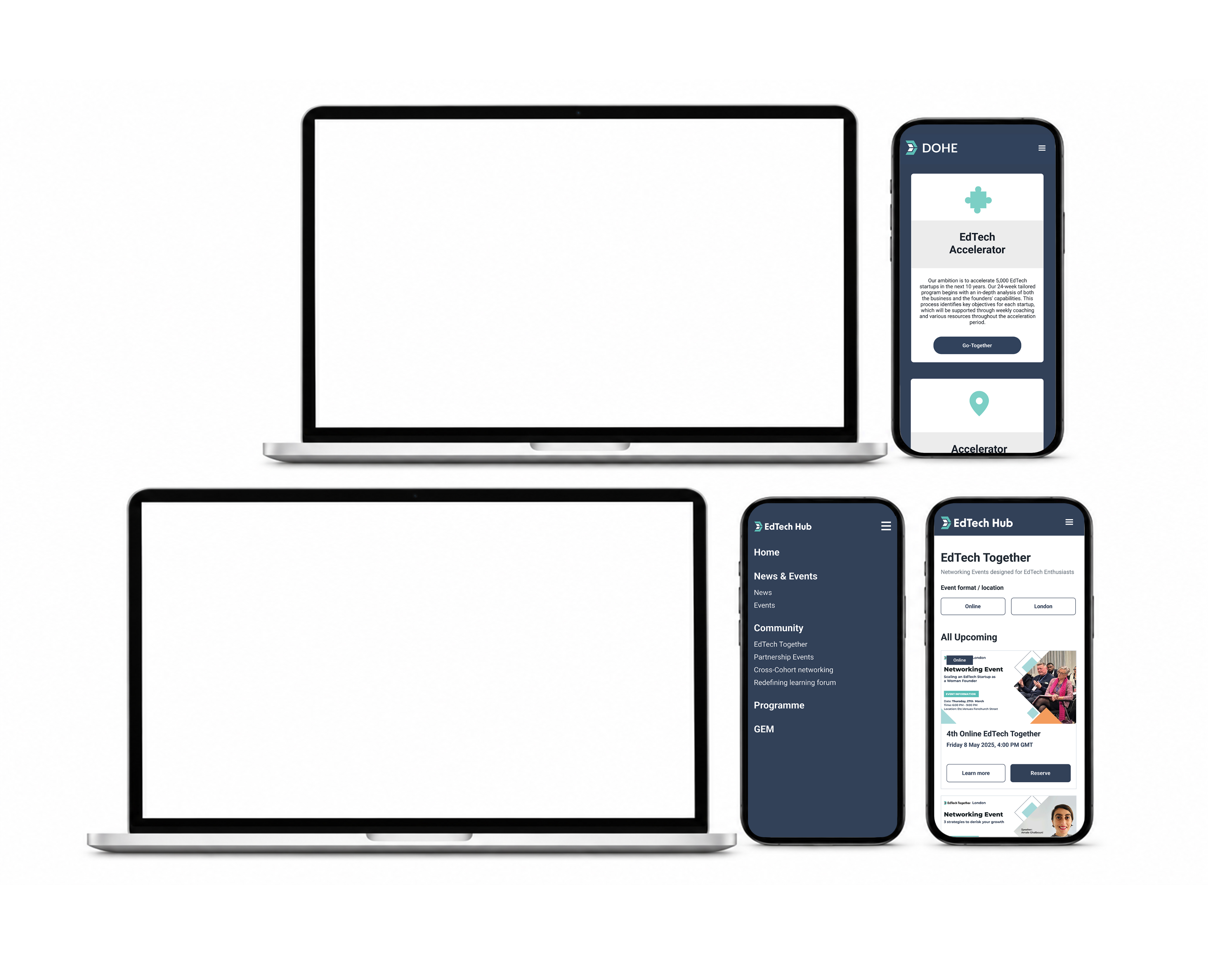
The central DOHE website established a clearer entry point to the three dedicated pillar websites. The EdTech Hub screens below are a separate, related UI example from the wider DOHE work—not the central homepage. No measured change in user behaviour is claimed.
ONGOING INTEGRATION
Bringing distinct pillar experiences into closer alignment
The three pillar websites continue to serve different purposes and content needs. The broader integration is being approached progressively; it is not presented here as a completed consolidation of all three websites.
RELATED SPECIALIST UI / EdTech Hub event experience (not the central DOHE homepage)
07 / VISUAL & BRAND DESIGN
ADDITIONAL DESIGN RESPONSIBILITIES
Extending DOHE’s identity across visual and physical touchpoints
Alongside the website experience, I created event communications and exhibition graphics for DOHE. I used existing brand colours and graphic elements while tailoring visual hierarchy, imagery and composition to each event.
This work is presented separately from the UX/Product narrative to show the breadth of my responsibilities without confusing visual campaign outputs with product-design results.
EVENT BANNERS & COMMUNICATIONS
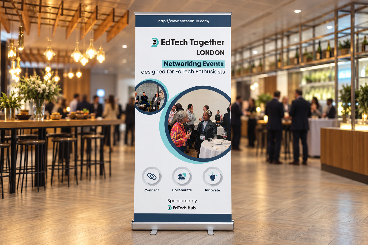
For EdTech Together, I designed event promotion across digital and printed touchpoints, using topic, date, time and venue hierarchy to make practical attendance information easier to scan.

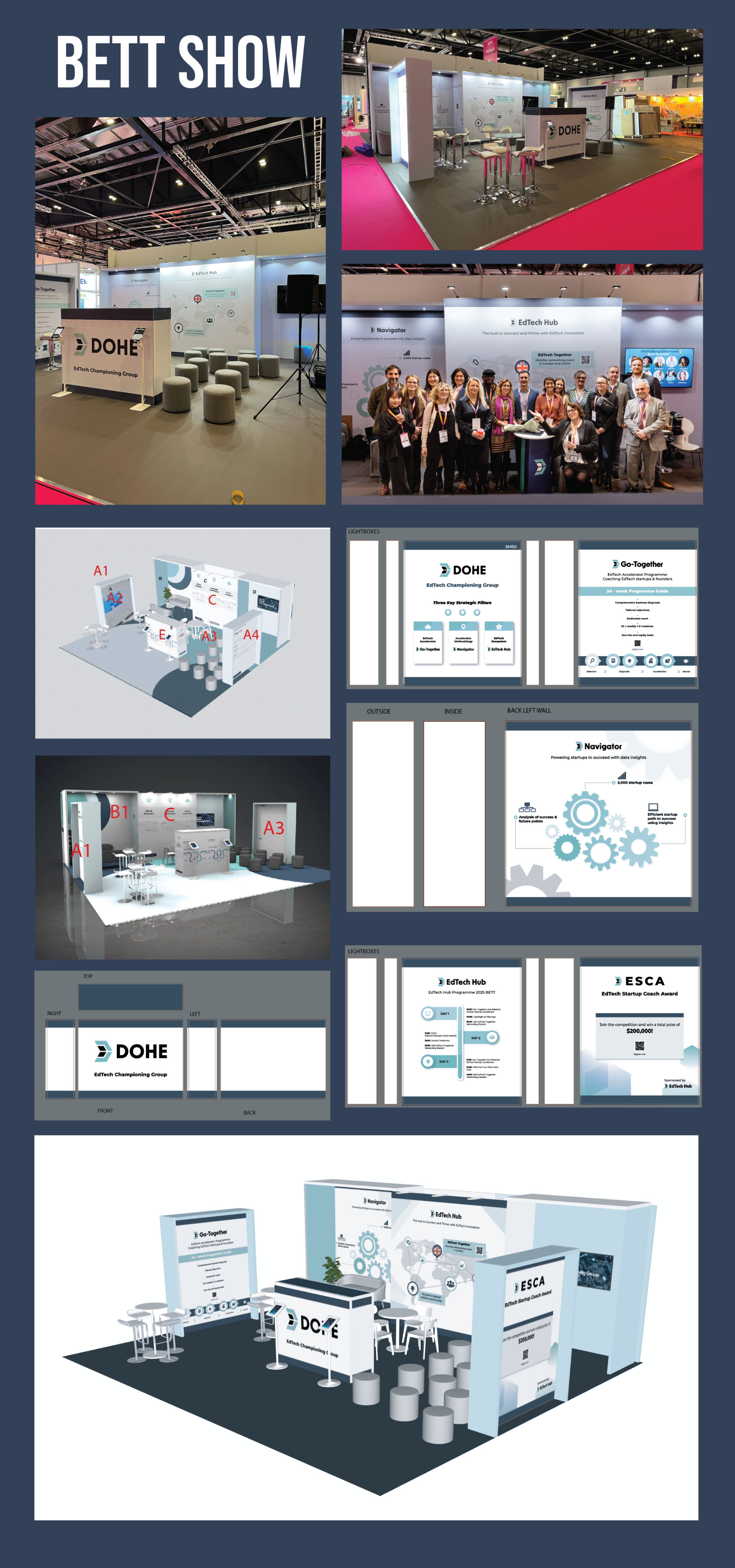
BETT EXHIBITION & BOOTH GRAPHICS
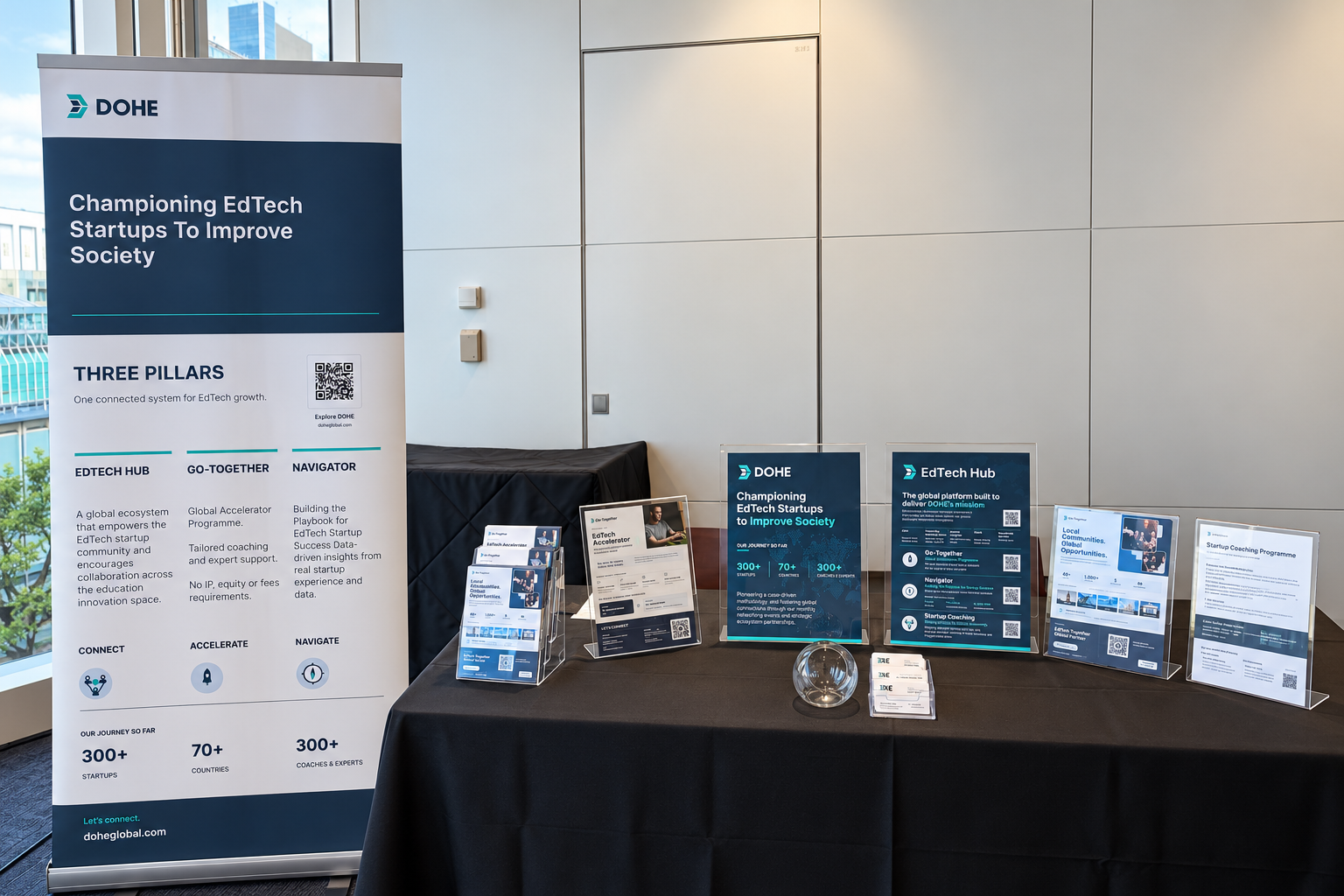
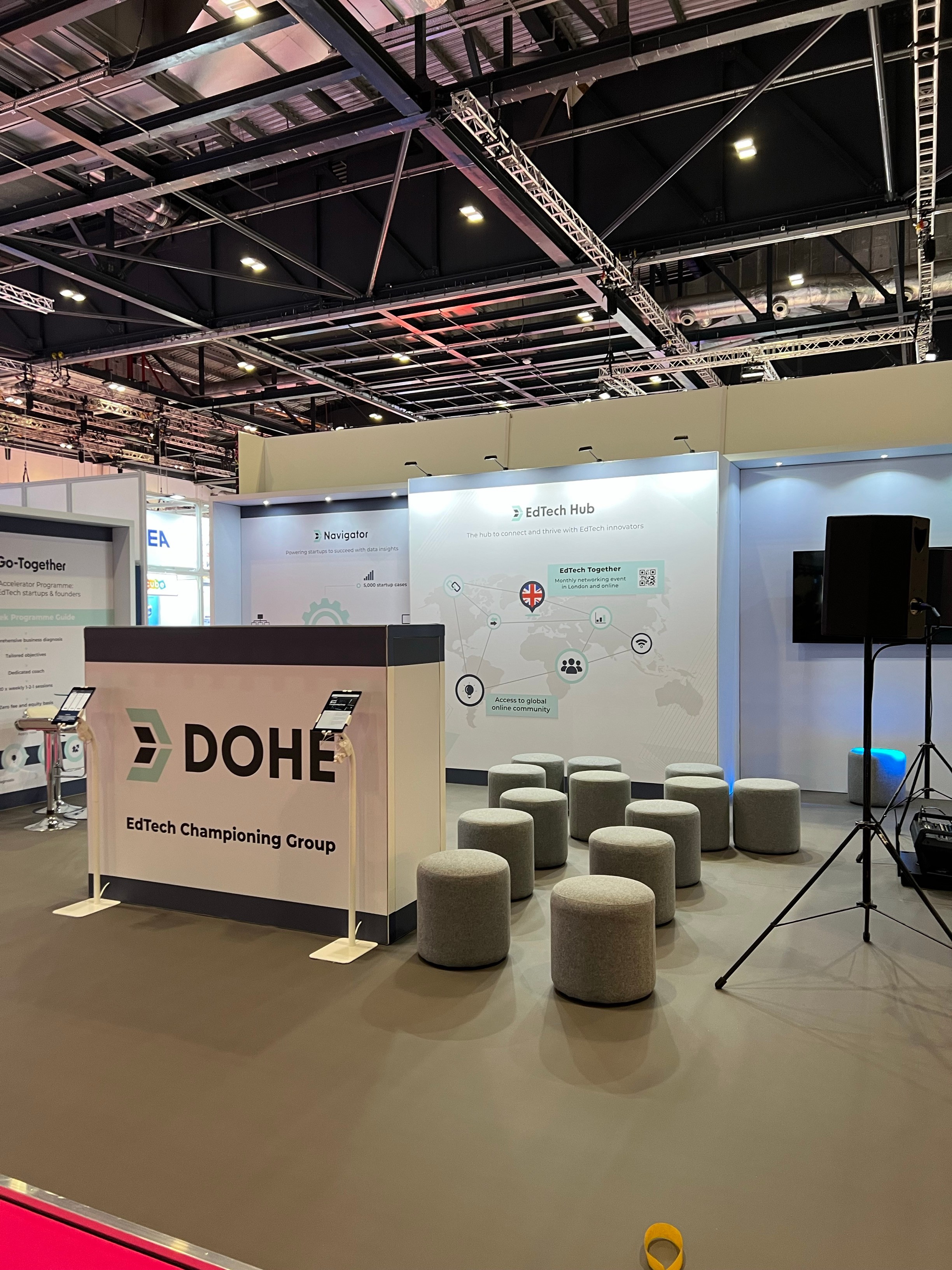
I designed the stand’s wall and front-facing graphics, introducing DOHE and programmes including EdTech Hub, Navigator and Go-Together. I coordinated graphic placement and artwork requirements with the exhibition supplier; physical stand engineering was not part of my scope.
Jinnie Hyojin Bae
← Work
DOHE
Unifying a Fragmented Digital Experience
I shaped the central DOHE website’s information architecture and UI with product and engineering, clarifying routes into three specialist experiences.
ROLE Design Manager INDUSTRY EdTech PERIOD 2024–Present
01 / CONTEXT & CHALLENGE
PROJECT CONTEXT
One organisation, three distinct pillars
DOHE operates across three core pillars, each with its own digital presence. The central DOHE website provides a clear entry point to three dedicated pillar websites.
DOHE
Central website
Go-Together
Dedicated website
Navigator
Dedicated website
EdTech Hub
Dedicated website
THE CHALLENGE
Creating a clearer digital entry point for DOHE
The challenge was to communicate DOHE's overarching identity and the relationship between its three pillars through one central website, while recognising the different content requirements of each specialist experience.
02 / UX AUDIT & INSIGHTS
Identifying barriers to content discovery and action
The existing website experience was reviewed to identify issues with information hierarchy, content discoverability and pathways to relevant actions. The qualitative audit highlighted three areas that informed the redesign.
UX Audit — Findings to Design Opportunities
UX FINDING
USER IMPLICATION
DESIGN OPPORTUNITY
Fragmented information architecture
Unclear content relationships
Clearer navigation and central entry point
Research-led, archive-style content
Difficult to identify key information
Prioritised content hierarchy
Limited pathways to action
Unclear next steps
More purposeful CTA pathways
03 / RESEARCH
RESEARCH / EXISTING EXPERIENCE AUDIT
Previous Portfolio and Cohorts pages show archive-style listings, extensive filters and repeated content cards—the visual evidence behind the findings in Section 02.
EXISTING WEBSITE EVIDENCE
Archive-style listings and cohort/country filters.
Cohort information and repeated startup entries.
04 / DESIGN
From fragmented information to a clearer entry point
Design rationale / Information architecture
THE PROBLEM
Fragmented information across separate websites
Archive-style content made the overarching DOHE structure difficult to understand.
THE DESIGN DECISION
One organisation overview, clear specialist routes
Prioritise an organisation-level introduction and its three core pillars, with routes to the specialist experiences.
LOW-FIDELITY WIREFRAMES
Structuring the website experience
The wireframes document how key content, navigation and the three core pillars are organised within the main DOHE website.
HIGH-FIDELITY / ADDITIONAL WEBSITE PAGES
Translating structure into a clearer digital experience
The high-fidelity pages show how the content structure was translated into interface layouts, with clearer hierarchy and navigation across related DOHE digital experiences.
05 / DELIVERY & ITERATION
INTERFACE GUIDANCE
Making event content clear for implementation
For EdTech Hub event pages, I documented full-title display, image sizes, heading and body typography, and rich-text formatting. This translated the intended content hierarchy into page-level implementation guidance.
Reusable interface patterns, navigation and layout conventions supported consistency across DOHE’s digital touchpoints.
PRODUCT & ENGINEERING COLLABORATION
Turning requirements into interface design
I worked with product managers and engineers to translate content and functional requirements into interface designs, reviewing layouts and refining details as requirements evolved.
Design decisions → Implementation guidance → Product and engineering review
06 / RESULTS
VERIFIED PROJECT OUTPUTS
Establishing a clearer foundation for DOHE’s digital ecosystem
The main DOHE website was redesigned to introduce the organisation and its three pillars through a clearer content and navigation structure. The work established a central place for essential information and pathways to specialist websites.
The central DOHE website established a clearer entry point to the three dedicated pillar websites. The EdTech Hub screens shown below are a separate, related interface example from the wider DOHE work—not images of the central homepage. No measured change in user behaviour is claimed.
ONGOING INTEGRATION
Bringing distinct pillar experiences into closer alignment
The three pillar websites continue to serve different purposes and content needs. The broader integration is being approached progressively; it is not presented here as a completed consolidation of all three websites.
RELATED SPECIALIST UI / EdTech Hub event experience (not the central DOHE homepage)
07 / VISUAL & BRAND DESIGN
ADDITIONAL DESIGN RESPONSIBILITIES
Extending DOHE’s identity across visual and physical touchpoints
Alongside the website experience, I created event communications and exhibition graphics for DOHE. I used existing brand colours and graphic elements while tailoring visual hierarchy, imagery and composition to each event.
This work is presented separately from the UX/Product narrative to show the breadth of my responsibilities without confusing visual campaign outputs with product-design results.
EVENT BANNERS & COMMUNICATIONS
For EdTech Together, I designed event promotion across digital and printed touchpoints, using topic, date, time and venue hierarchy to make practical attendance information easier to scan.
BETT EXHIBITION & BOOTH GRAPHICS
I designed the stand’s wall and front-facing graphics, introducing DOHE and programmes including EdTech Hub, Navigator and Go-Together. I coordinated graphic placement and artwork requirements with the exhibition supplier; physical stand engineering was not part of my scope.