← Work
DESIGNING WITH AI
Exploring an AI-assisted portfolio design workflow using ChatGPT and Figma.
PERSONAL PROJECT · UX/UI DESIGN · DESIGN SYSTEMS · AI-ASSISTED WORKFLOW
01 / OVERVIEW
THE PROJECT
Exploring a more structured AI-assisted design workflow
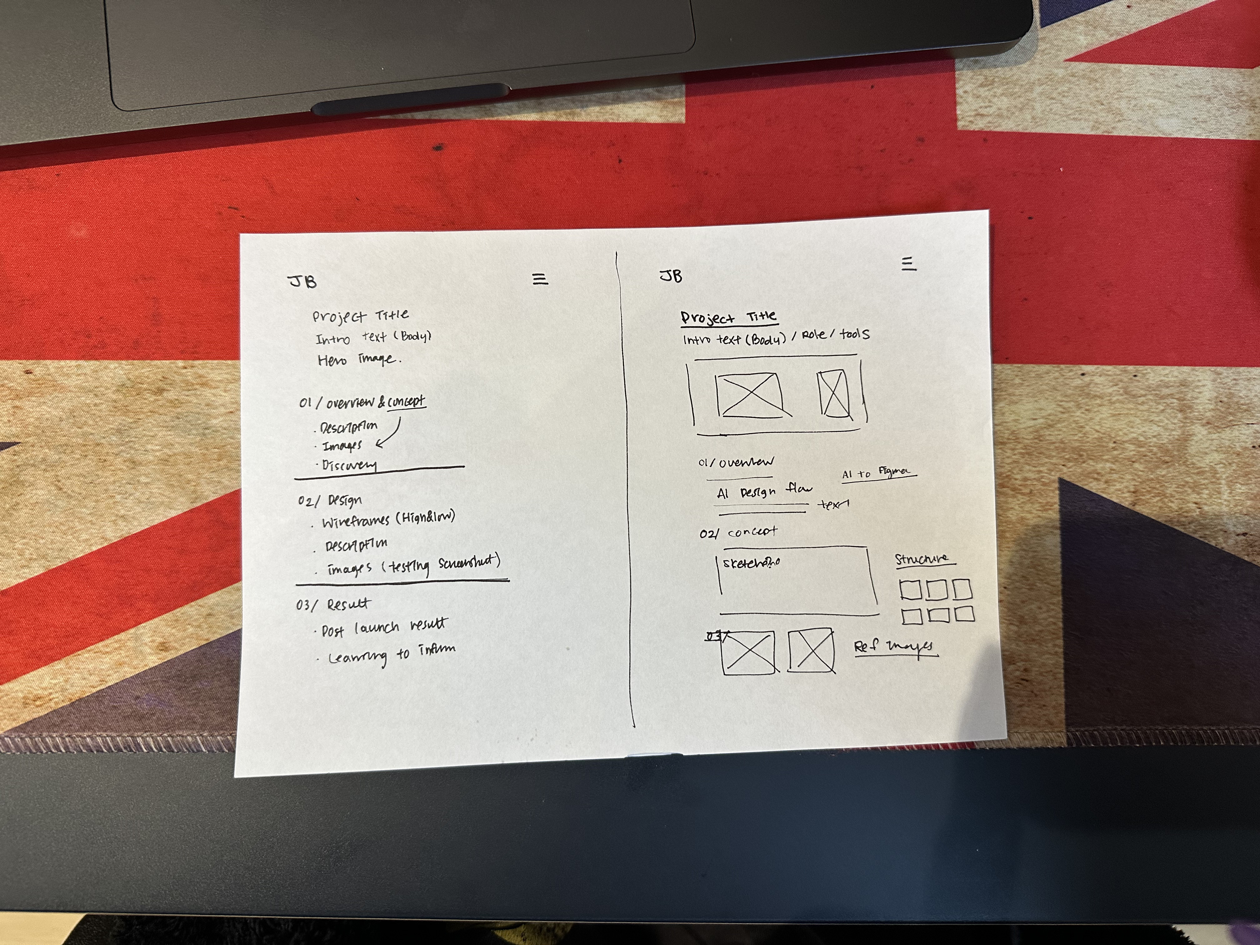
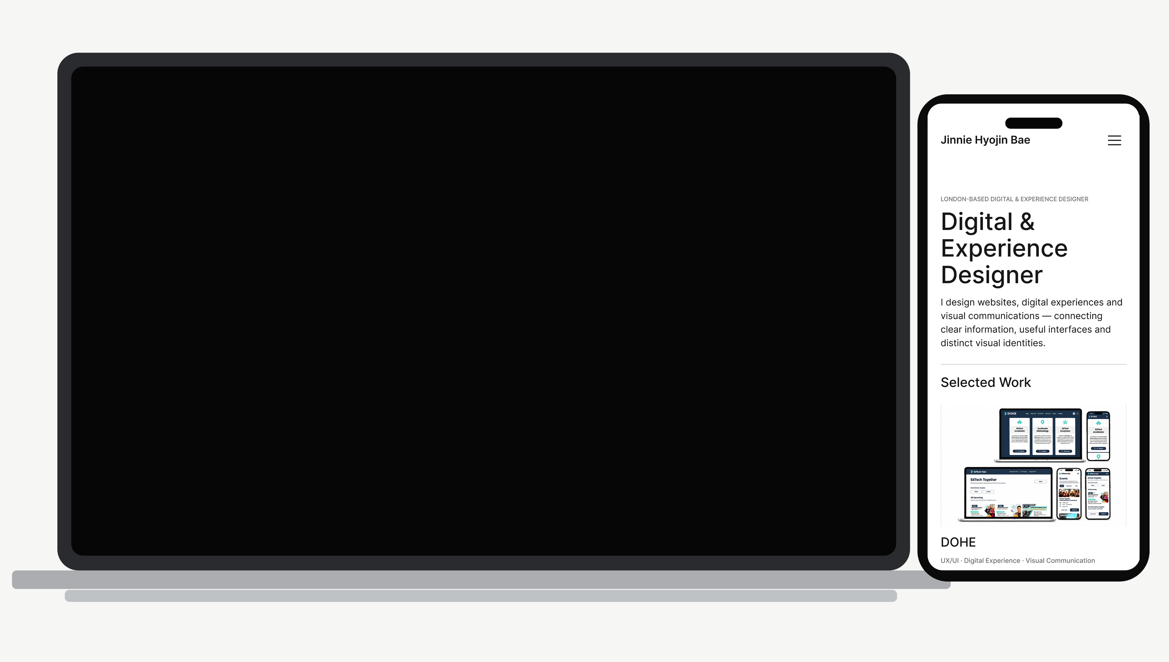
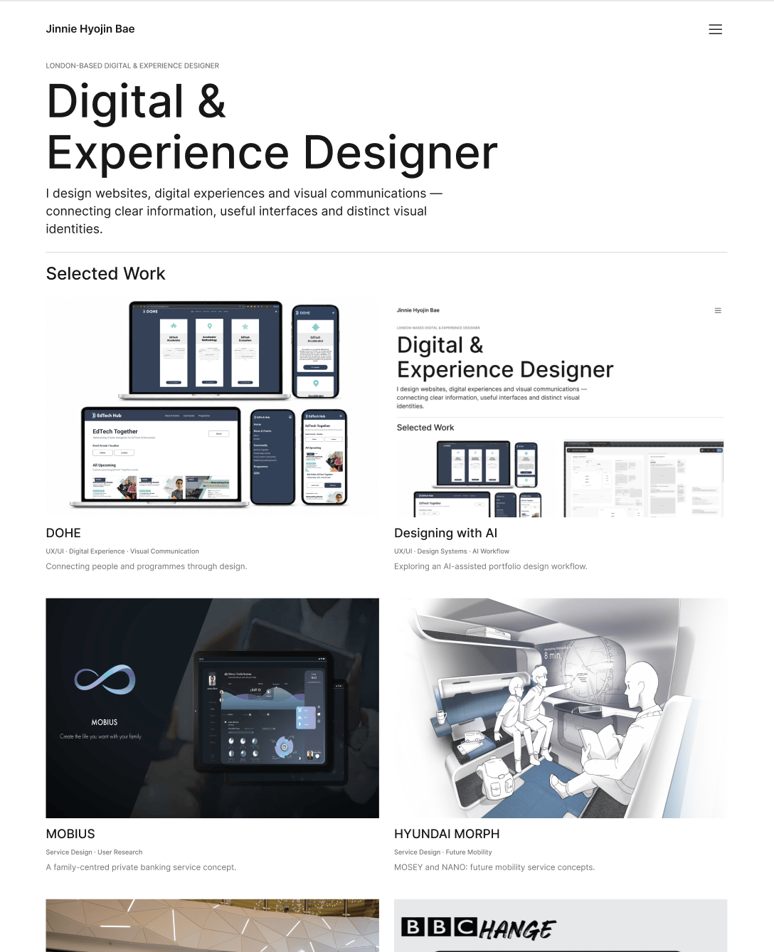
This project documents how I used ChatGPT and Figma to design and refine my personal portfolio, exploring how AI could support work from content planning to interface refinement.
My aim was to present multidisciplinary projects through a consistent visual language, with clear navigation, reusable layouts and a structured approach to case studies.
Rather than treating AI-generated outputs as finished designs, I defined requirements, reviewed changes in Figma and refined the details. The portfolio remains a Figma design and prototype; no unverified deployment is claimed.
02 / CONCEPT
STARTING ANALOG
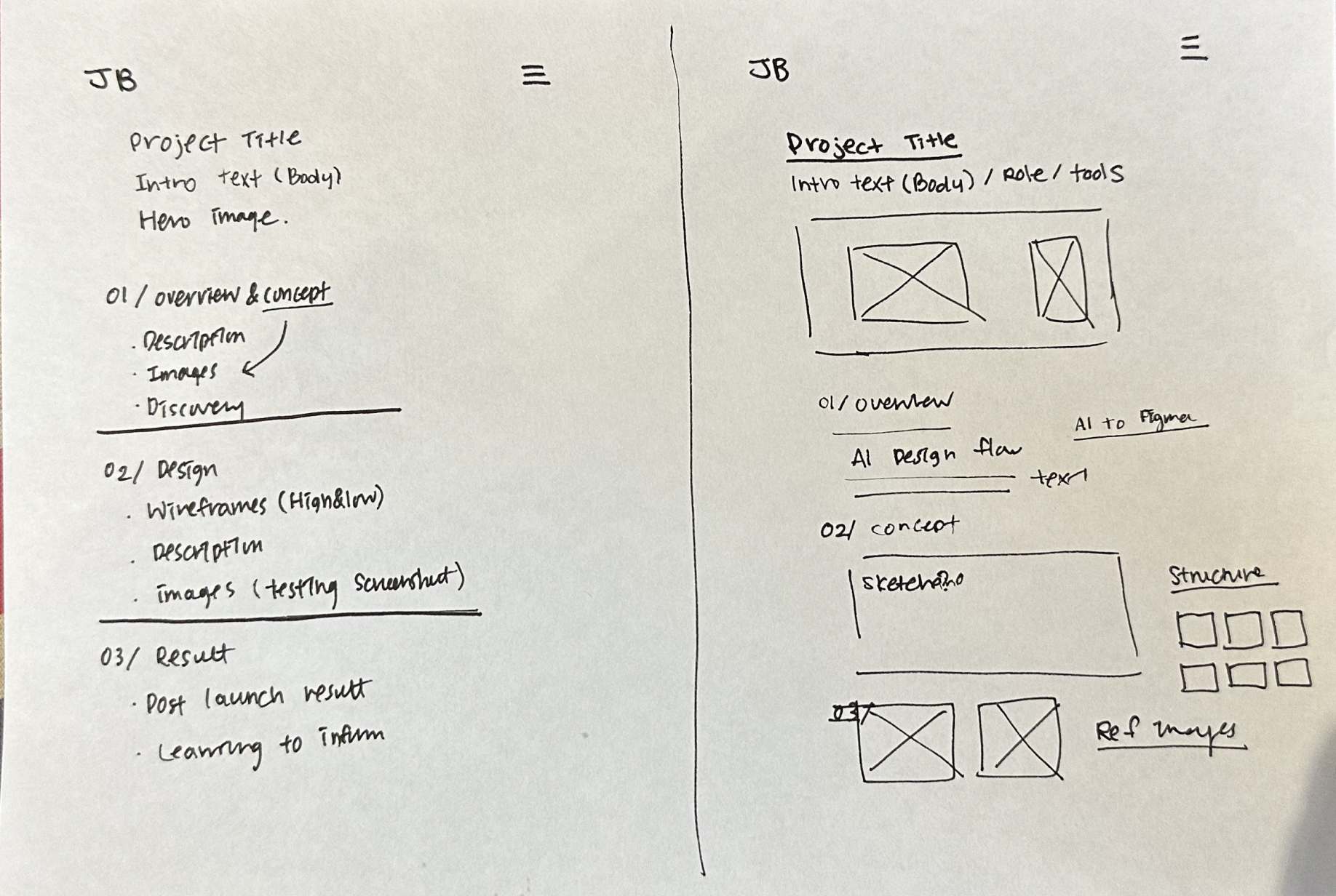
Sketching the initial portfolio structure
I explored the portfolio’s information architecture, project discoverability and the way visitors would move between the homepage, Selected Work and individual case studies.
VISUAL DIRECTION
Editorial minimalism as a north star
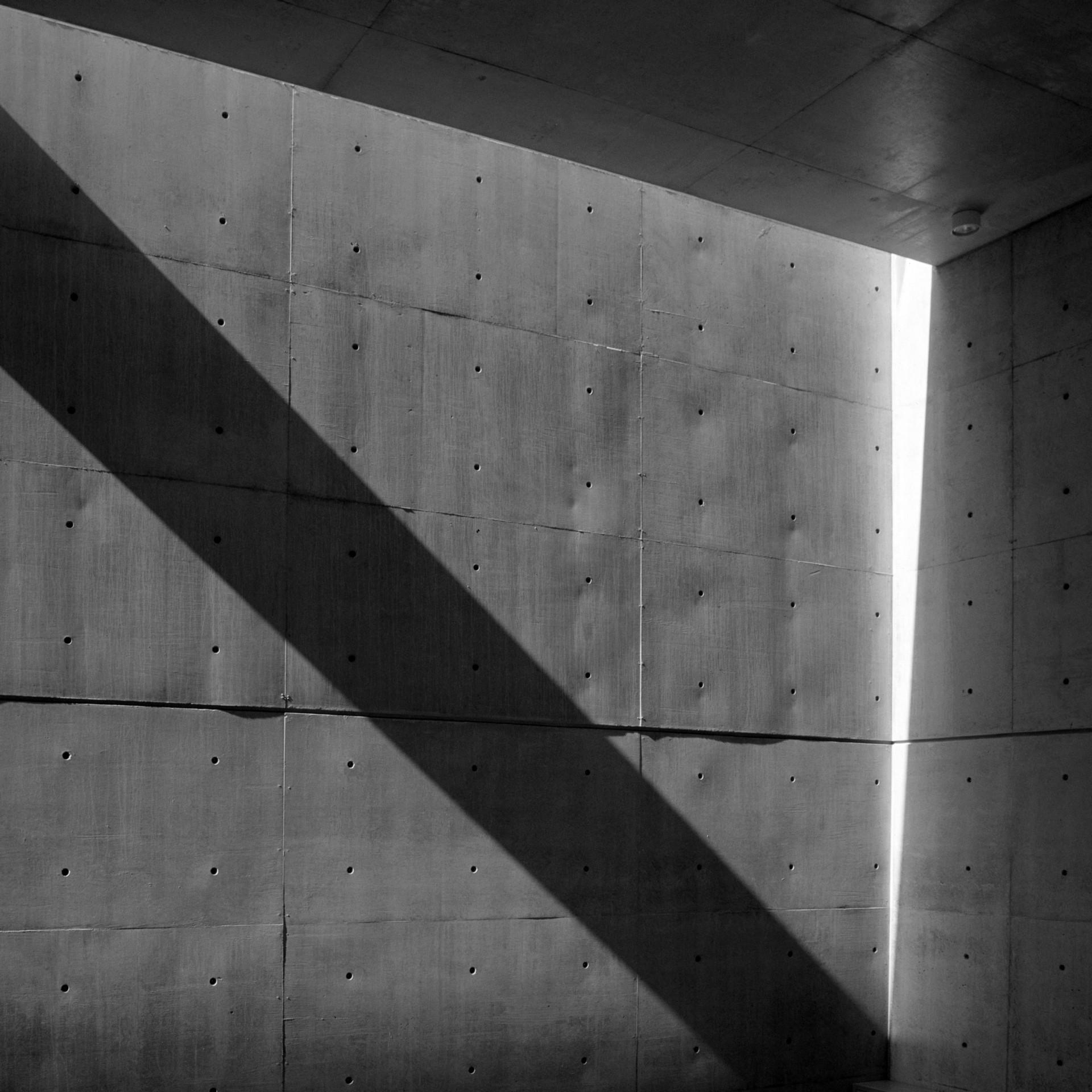
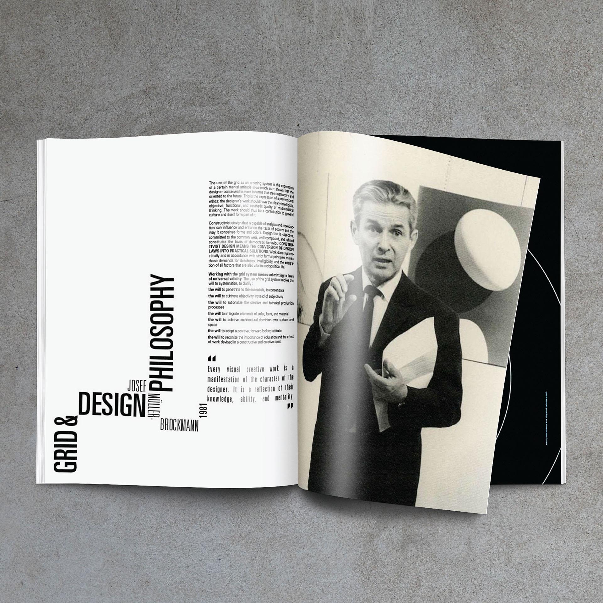
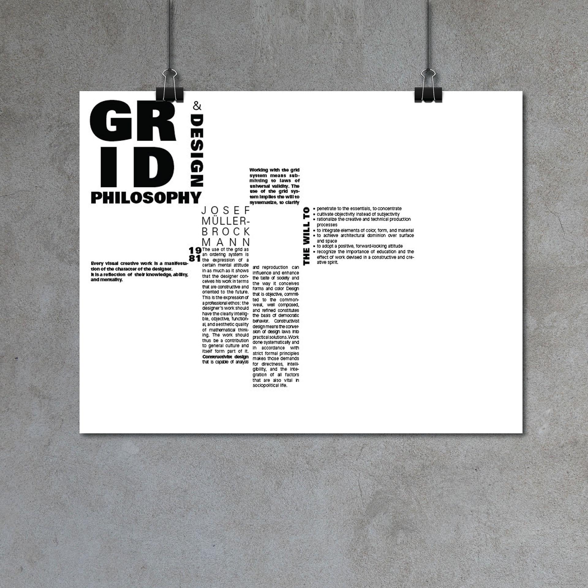
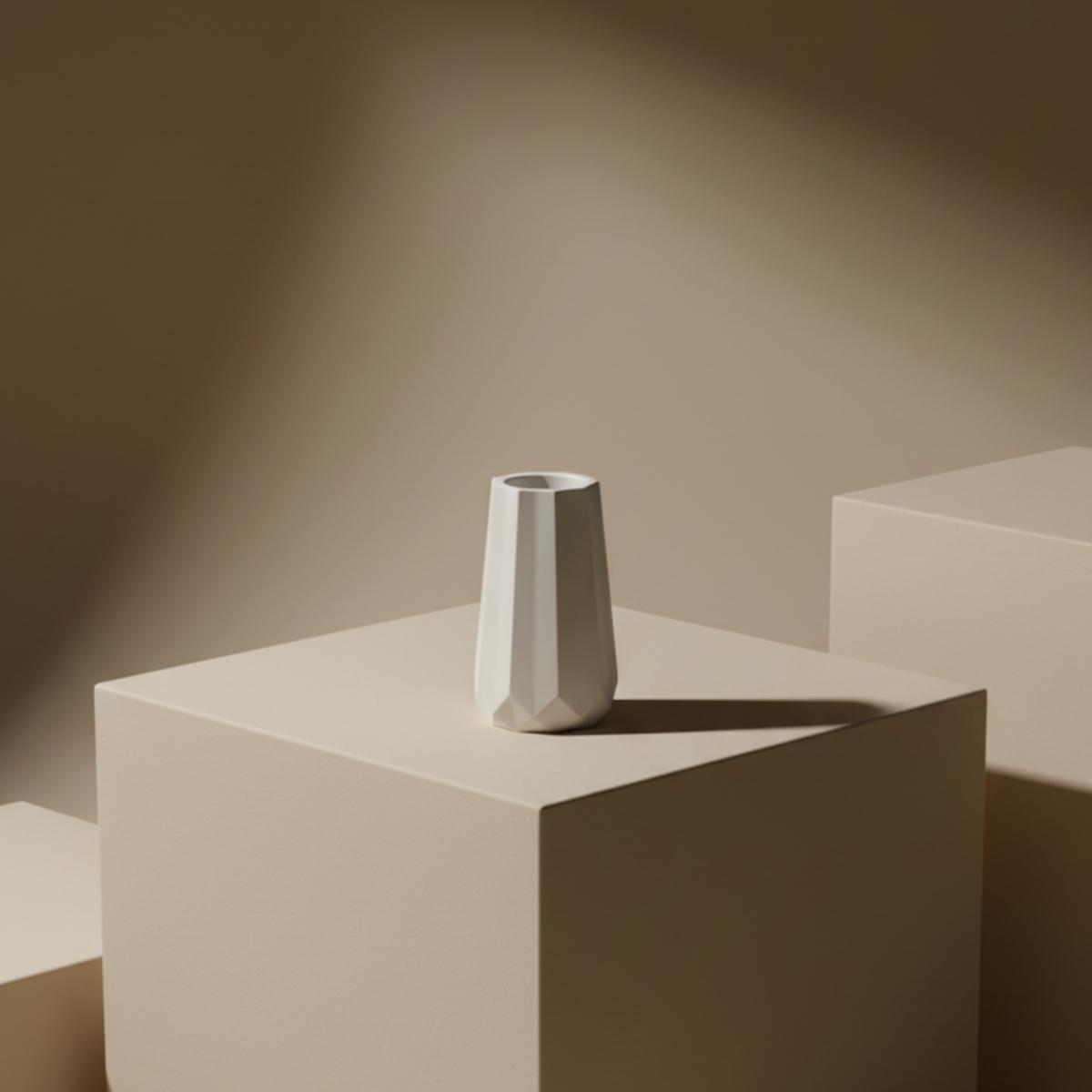
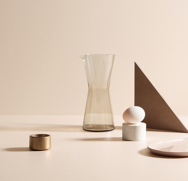
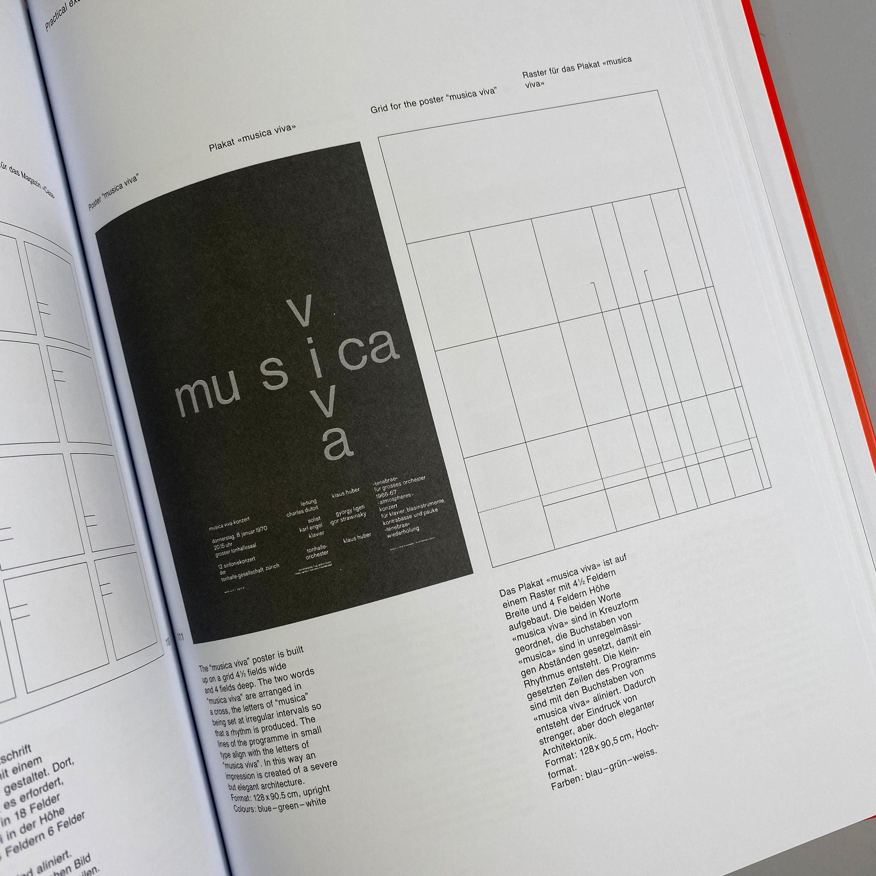
I used a minimal editorial direction defined by the approved Version 3 Portfolio Brand Guidelines: legible hierarchy, generous whitespace, restrained black and grey, and image-led project presentation.
The reference collage below is reserved for accurately sourced examples, such as relevant editorial portfolios and studios. It will be populated only after the original references and permission to use each image have been checked.
03 / DESIGN
STEP ONE / COMPONENT LIBRARY
Creating a reusable visual system
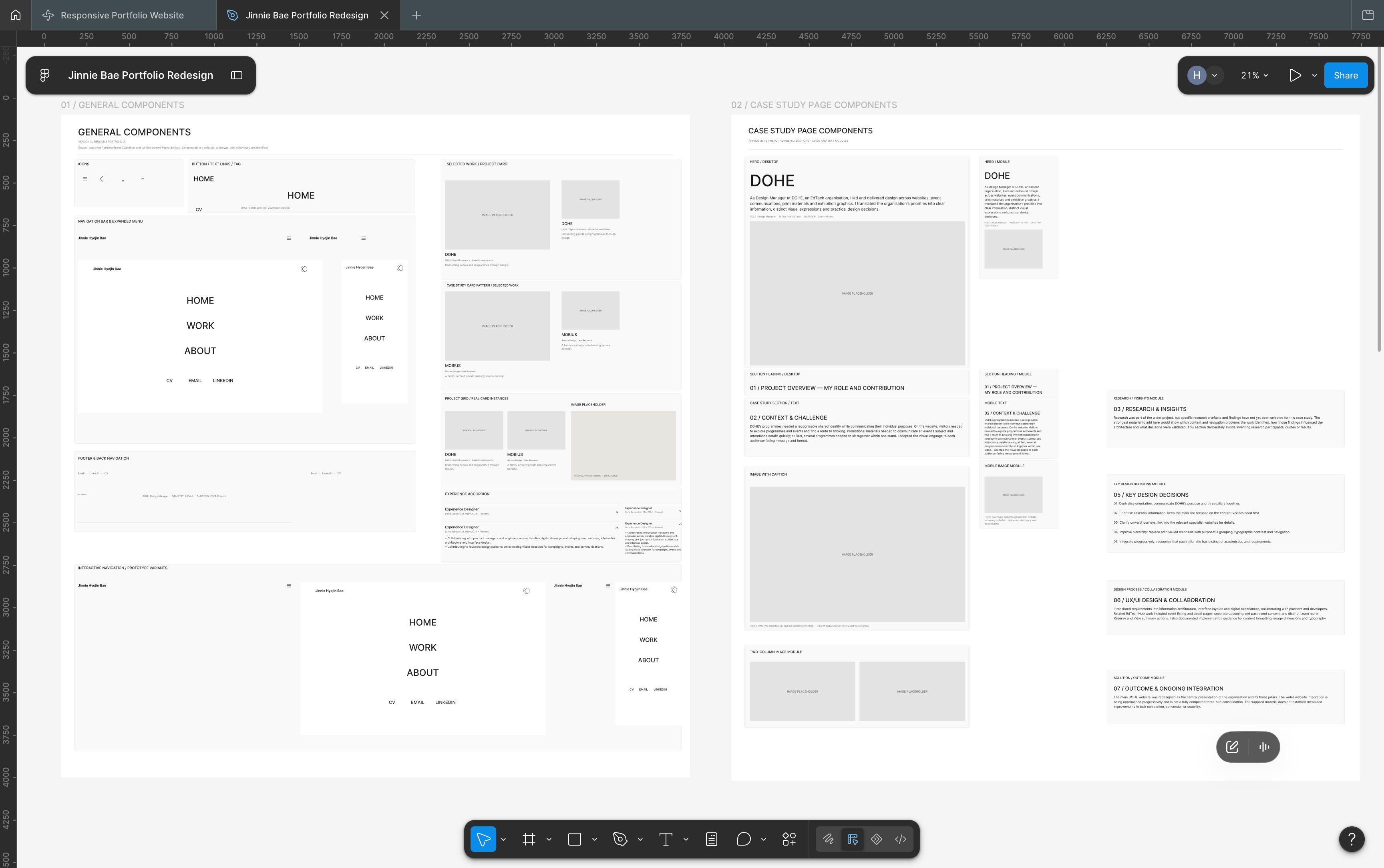
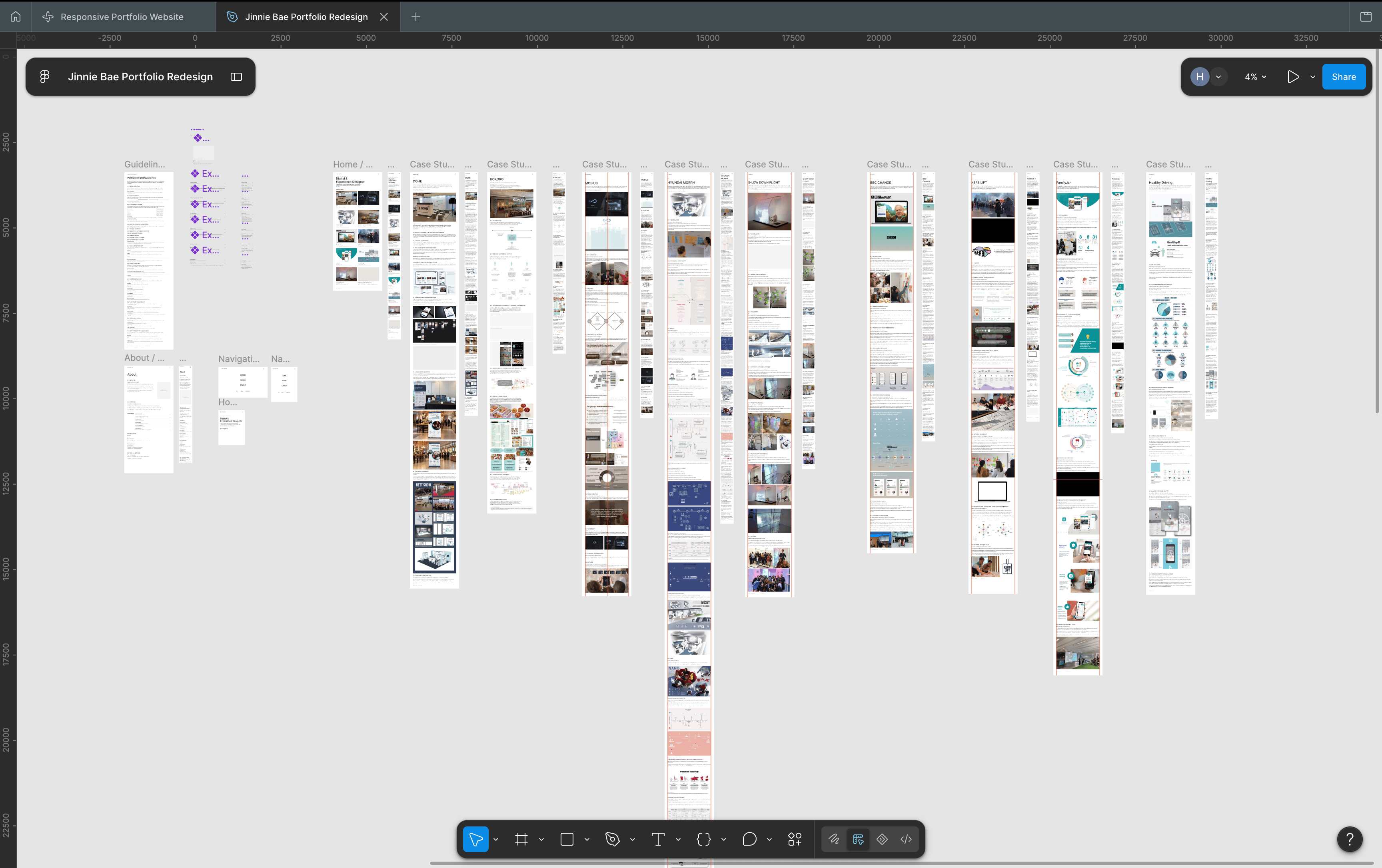
I developed a component library from the portfolio’s existing UI and organised it into separate General Components and Case Study Page Components boards. It includes typography-based navigation, project cards, case-study modules, responsive variants and the Experience accordion.
This library was refined alongside the page designs rather than completed in a single upfront stage. Real component sets, text properties and prototype states were checked in Figma.
STEP TWO / PAGE LAYOUTS
Building consistent page layouts
I applied the existing visual system across the homepage, Selected Work, About and individual case studies. Each screen balances imagery with concise project information, while desktop and mobile use related but responsive structures.
I reviewed card alignment, image proportions, spacing, footers and hamburger navigation directly in the connected Figma file.
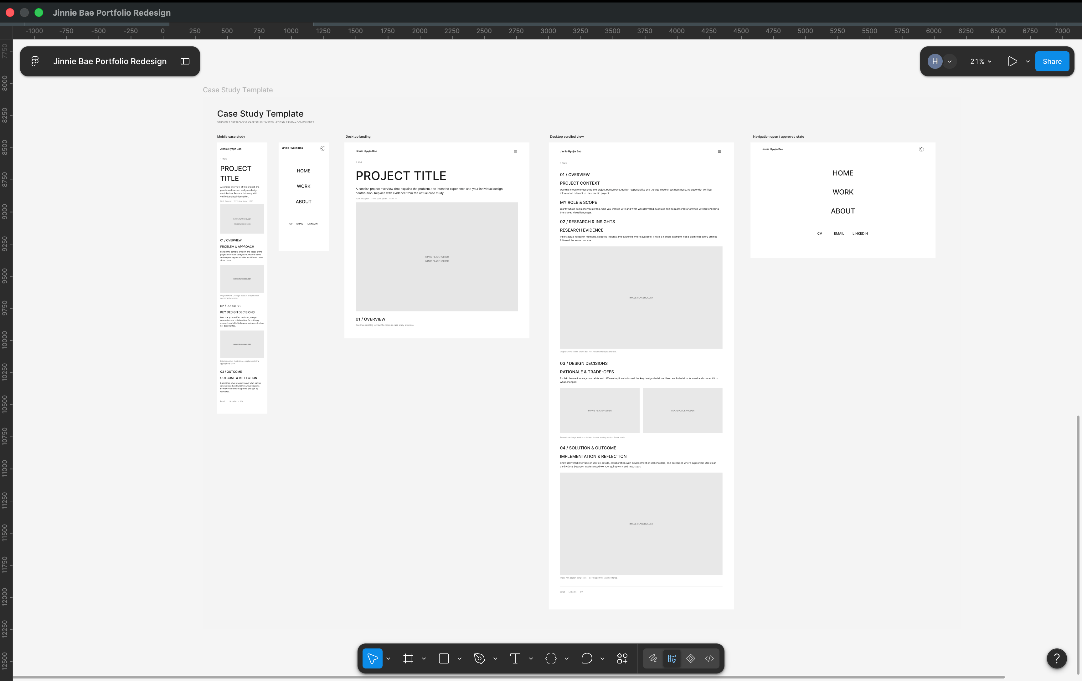
STEP THREE / CASE STUDY TEMPLATE
Creating a flexible case study framework
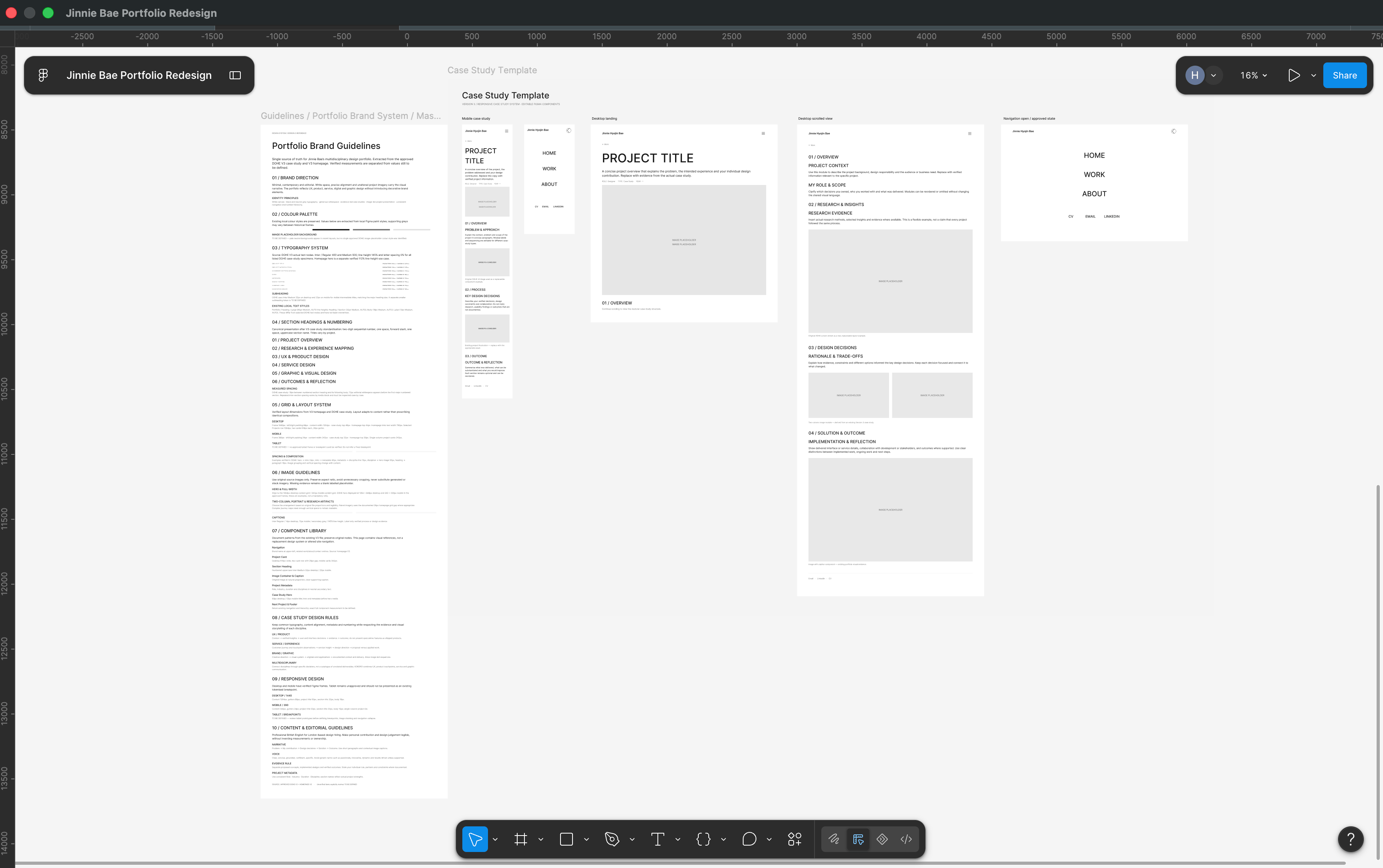
The portfolio uses recognisable project titles, metadata, numbered sections, image treatments and ← Work navigation. These shared patterns make the case studies easier to follow while allowing individual projects to emphasise different design decisions.
I built genuine editable case-study components for hero areas, section headings, text modules and image-and-caption arrangements.
04 / CHATGPT + FIGMA WORKFLOW
THE CORE WORKFLOW
Using ChatGPT to support design development and iteration
I used ChatGPT to turn visual direction and content requirements into specific Figma tasks, then checked the result against the approved design system and my actual project information.
The connected Figma workflow supported repeated refinement: improving navigation structure, correcting card alignment and mobile spacing, organising component masters, testing accordion interactions and reshaping case-study narratives.
I did not use Claude Code or GitHub for this work, and I am not claiming a coded production build.
01
DESIGN DIRECTION
02
CHATGPT INSTRUCTIONS
03
FIGMA DESIGN
04
REVIEW & REFINEMENT
KEY MOMENTS
What the connected workflow actually looked like
01 / Defined the homepage and case-study structure around project discoverability.
02 / Refined the HOME, WORK and ABOUT navigation and desktop/mobile menu states.
03 / Organised genuine reusable UI components, responsive variants and editable properties.
04 / Built the Experience accordion with collapsed and expanded states and checked that other content moved down.
05 / Corrected image positioning, Selected Work card alignment and responsive spacing.
06 / Revised DOHE and Designing with AI narratives while retaining original project evidence and separate versions.
05 / FROM DESIGN TO FIGMA SITES
PLANNED / NOT PUBLISHED
Preparing the design for future implementation
The Version 3 portfolio currently exists as a Figma design and prototype. A future Figma Sites stage may include reviewing responsive behaviour, translating layouts, checking menu overlays and validating internal and external links.
This section documents intended next steps only. Transfer to Figma Sites, publication and browser-based validation have not been verified as completed.
06 / LEARNINGS
01 / THE VALUE OF CLEAR DESIGN INSTRUCTIONS
How constraints shape the result
02 / DESIGN SYSTEMS AS A COMMUNICATION TOOL
Why component structure and naming matter
03 / HUMAN JUDGEMENT IN AI-ASSISTED DESIGN
Reviewing and correcting AI-assisted work
← Work
Jinnie Hyojin Bae · Work · About · Contact
Jinnie Hyojin Bae
← Work
DESIGNING WITH AI
Exploring an AI-assisted portfolio design workflow using ChatGPT and Figma.
PERSONAL PROJECT · UX/UI DESIGN · DESIGN SYSTEMS · AI-ASSISTED WORKFLOW
01 / OVERVIEW
THE PROJECT
Exploring a more structured AI-assisted design workflow
This project documents how I used ChatGPT and Figma to design and refine my personal portfolio, exploring how AI could support work from content planning to interface refinement.
My aim was to present multidisciplinary projects through a consistent visual language, with clear navigation, reusable layouts and a structured approach to case studies.
Rather than treating AI-generated outputs as finished designs, I defined requirements, reviewed changes in Figma and refined the details. The portfolio remains a Figma design and prototype; no unverified deployment is claimed.
02 / CONCEPT
STARTING ANALOG
Sketching the initial portfolio structure
I explored the portfolio’s information architecture, project discoverability and the way visitors would move between the homepage, Selected Work and individual case studies.
VISUAL DIRECTION
Editorial minimalism as a north star
I used a minimal editorial direction defined by the approved Version 3 Portfolio Brand Guidelines: legible hierarchy, generous whitespace, restrained black and grey, and image-led project presentation.
The reference collage below is reserved for accurately sourced examples, such as relevant editorial portfolios and studios. It will be populated only after the original references and permission to use each image have been checked.
03 / DESIGN
STEP ONE / COMPONENT LIBRARY
Creating a reusable visual system
I developed a component library from the portfolio’s existing UI and organised it into separate General Components and Case Study Page Components boards. It includes typography-based navigation, project cards, case-study modules, responsive variants and the Experience accordion.
This library was refined alongside the page designs rather than completed in a single upfront stage. Real component sets, text properties and prototype states were checked in Figma.
STEP TWO / PAGE LAYOUTS
Building consistent page layouts
I applied the existing visual system across the homepage, Selected Work, About and individual case studies. Each screen balances imagery with concise project information, while desktop and mobile use related but responsive structures.
I reviewed card alignment, image proportions, spacing, footers and hamburger navigation directly in the connected Figma file.
STEP THREE / CASE STUDY TEMPLATE
Creating a flexible case study framework
The portfolio uses recognisable project titles, metadata, numbered sections, image treatments and ← Work navigation. These shared patterns make the case studies easier to follow while allowing individual projects to emphasise different design decisions.
I built genuine editable case-study components for hero areas, section headings, text modules and image-and-caption arrangements.
04 / CHATGPT + FIGMA WORKFLOW
THE CORE WORKFLOW
Using ChatGPT to support design development and iteration
I used ChatGPT to turn visual direction and content requirements into specific Figma tasks, then checked the result against the approved design system and my actual project information.
The connected Figma workflow supported repeated refinement: improving navigation structure, correcting card alignment and mobile spacing, organising component masters, testing accordion interactions and reshaping case-study narratives.
I did not use Claude Code or GitHub for this work, and I am not claiming a coded production build.
01
DESIGN DIRECTION
02
CHATGPT INSTRUCTIONS
03
FIGMA DESIGN
04
REVIEW & REFINEMENT
KEY MOMENTS
What the connected workflow actually looked like
01 / Defined the homepage and case-study structure around project discoverability.
02 / Refined the HOME, WORK and ABOUT navigation and desktop/mobile menu states.
03 / Organised genuine reusable UI components, responsive variants and editable properties.
04 / Built the Experience accordion with collapsed and expanded states and checked that other content moved down.
05 / Corrected image positioning, Selected Work card alignment and responsive spacing.
06 / Revised DOHE and Designing with AI narratives while retaining original project evidence and separate versions.
05 / FROM DESIGN TO FIGMA SITES
PLANNED / NOT PUBLISHED
Preparing the design for future implementation
The Version 3 portfolio currently exists as a Figma design and prototype. A future Figma Sites stage may include reviewing responsive behaviour, translating layouts, checking menu overlays and validating internal and external links.
This section documents intended next steps only. Transfer to Figma Sites, publication and browser-based validation have not been verified as completed.
06 / LEARNINGS
01 / THE VALUE OF CLEAR DESIGN INSTRUCTIONS
How constraints shape the result
02 / DESIGN SYSTEMS AS A COMMUNICATION TOOL
Why component structure and naming matter
03 / HUMAN JUDGEMENT IN AI-ASSISTED DESIGN
Reviewing and correcting AI-assisted work
← Work
Jinnie Hyojin Bae
Jinnie Hyojin Bae · Work · About · Contact